As you might have noticed I changed up the layout a bit and I am really excited about that! I believe that little changes can have a great effect. I am also sharing some usability tips with you to use on your own blog!
Usability Tips
I study information science so I learned a lot about usability of websites. I am going to share a few tips with you to keep in mind while designing a blog layout!
♥ The most important thing to remember while designing a layout is to keep it simple. You do not want to use too many fonts and you don’t want a layout that looks too crazy. Besides that people like to read from white background and text in a readable font.
♥ An other important thing to do is to choose a blog name that people can actually remember, because you want your visitors to come back right?
♥ When someone visits your blog it should immediately be clear what your blog is about. There are a million blogs on the internet and people come on your blog as easy as they go. So make sure you keep their attention.
♥ Something I often see on blogs is that the logo is not clickable. People expect to go back to the homepage of your blog when they click on your logo so make sure that little magic trick happens!
♥ The most important links on your blog should be visible on your homepage. The lack of a fast website navigation leads to annoyance of your visitors. The navigation should be on a noticeable place, for example on the top of your blog. Also do not go crazy with the amount of links, aim for less than eight items in your main menu overview. If you want to use more links then use a drop down menu.
♥ I do not see this very often, but sometimes I see blogs that still have a background sound. Please get rid of that annoying music, it is very amateurish.
♥ Avoid spelling mistakes as much as possible. If you are not sure about your own spelling skills then let someone else read your blog posts before you publish them.
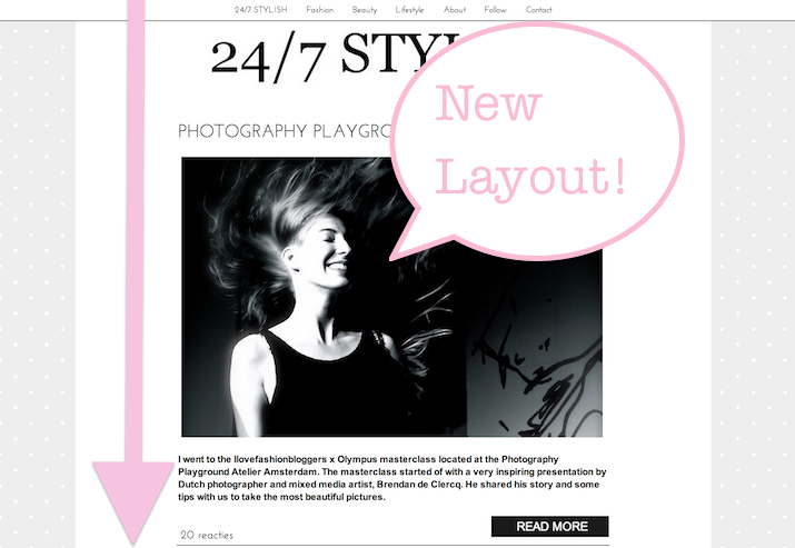
New Layout on 24/7 Stylish
Yesterday evening I staid up late to make the changes and here it is… the official new look of 24/7 Stylish! I am really excited about the way it turned out. The new layout is a lot lighter than before. The menu bar at the top used to be completely black. Now I decided to use the color scheme white, pink and a light grey.
The fonts on my blog have changed as well. I went for a ‘thin’ font to make the blog title stand out more. I used the same font in the menu bar, for the comments and link hovers.
I left the dotted background and the logo for what it is, because I really like the way they look.
I am really happy with the new layout of 24/7 Stylish, but of course I am wondering what you think about it! So please leave a comment below and tell me what you think!

Mooie layout! Het is lekker simpel, maar wel interessant en vrouwelijk 🙂 De stipjes op de achtergrond geven net een extra toevoeging xxx
Mooie lay-out!
Dat moment dat jou lay-out online gaat is zo magisch en heerlijk 🙂 Ik vind het erg mooi geworden meid! Ik denk inderdaad ook dat je met een minimalistische lay-out het maximale eruit haalt 🙂
Veel blog plezier met je nieuwe lay-out! Liefs!
Ziet er goed uit! Kleine aanpassingen kunnen inderdaad een groot verschil maken. Zelf ben ik ook bezig met een vernieuwde lay out. Als alles klaar is geeft dat altijd zo'n lekker gevoel!
Ah good job girl!
Thank you for the tips! They are very useful 🙂
X kate
Ik wist niet hoe de oude layout eruit zag, maar het ziet er heel leuk uit!
Wat is je layout mooi geworden zeg!
Ziet er echt mooi uit <3
xoxo
http://www.its-dash.com
Echt een prachtige lay out wauw <3 Liefs
Heel mooi! Ik vind vooral die balk bovenin die meebeweegt erg handig en mooi, hoe heb je dat gedaan?
x
Goeie tips!
Super mooie layout! En echt fijne tips, idd die achtergrond muziek is soms niet te harden…
Je lay-out ziet er erg mooi uit, heel professioneel!